
Q: Can you promise me I’ll be back playing in six months?
This was the question I received yesterday. I’m a strong advocate for criteria-based rehabilitation and often quote the saying: “If you’re not assessing, you’re guessing.”
I responded by asking what tests had been done. Rehab isn’t just about rehab length or experience of an “expert”; it’s about consistently measuring progress and adjusting plans based on objective data. 📊✅
Making Data Meaningful for Patients
Seeing most of my ACL patients through online consultations, I often focus on presenting key metrics, including:
Injury insights: 🩹📊
Self-reported questionnaires: 📝🤔
Movement analysis: 🏃♂️📈
Strength testing: 💪📐
Jump testing: 🦵⬆️
Your facilities determine your ability to test. That’s why I always advise my online clients to find a gym that can perform muscle strength testing and force plate testing.
By visualizing the rehabilitation progress, your dashboards can reveal both strengths and gaps, enabling us to create a realistic rehab journey rather than relying on arbitrary timelines. 🗓️
Why Data Matters in Physiotherapy?
In my experience, using data and visualization can establish a common language between athletes, coaches, stakeholders, and rehab teams. It fosters smoother collaboration and helps prevent setbacks or costly errors. However, your data is only as reliable in the way you standardised it or interpreting. Misreading data assumptions can also lead to flawed decisions. 🤝❌
Over the past year, PowerBI has been one of my learning focuses. I’m still navigating to create meaningful dashboards that tell a story and serve as a roadmap for rehab. 🖥️📈
Testing Is Non-Negotiable in ACL rehab!
No patient with an ACL injury or reconstruction should go through rehab without being tested multiple times. While data visualization can be time-consuming, tools like Power BI help analyze and present results effectively, offering insights that fit within my practice.
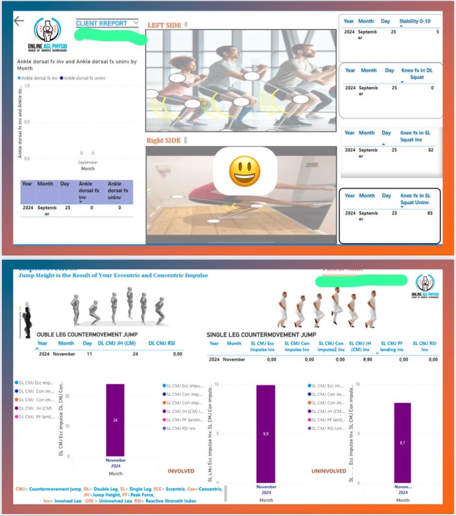
Here are a few screenshots of my reports to show how I’m visualizing rehab progress. 📸
I would love to hear from you! How are you presenting your data? What tools are you using (excel/powerbi/other) and how do you design / group your outcomes?
If you using visualisation, I would like collaborate and learn from each other to make rehab even better! 💡
If you are a patient, do not hesitate to reach out and let us have a chat. This can either be before your surgery, if you feeling stuck in your rehab, or want to optimise your rehab.
For more information please check out my ACL patient handbook: http://www.andreasphysioblog.com
https://andreasphysioblog.com/?page_id=519
Best regards
Andreas Bjerregaard
Certified Clinician in Sports physiotherapy
IOC Diploma in Sports Physical Therapy
Check out
💻Web: https://lnkd.in/dURMF-5g
📸IG: Andreasphysioblog https://lnkd.in/eZb9A2WJ
📚ResearchGate: https://lnkd.in/dd945uWB
🗞️Newsletter: https://lnkd.in/e8MgwUHv
🙋Online ACL Consultation: https://lnkd.in/dbiz6864

